
“I don’t run to add days to my life, I run to add life to my days.”
Introducing Stryde, a running focused platform to guide individuals reach their full potential on and off road.
Timeline: Approx. 5-6 Months
Area of Interest: Health & Fitness
Role: UX Design Student at CareerFoundry - UI Specialization Project.
Stryde.


PROBLEMThe fitness industry is complicated enough. Can we simplify it to focus on what matters most, your training?
The fitness industry has become saturated and finding a reliable program can be stressful. Stressful enough that will make some people stop before even starting. What if there is a space where people can just start as simple as running and get their journey going?

SOLUTIONImagine an app that gets you straight to the starting line.

Simplicity
Hit start and begin your training.
Straight to the point
Finding Your Tribe
Connecting those who have the same goals as you
Provides a community for you to grow
Share aspirations and goals with each other


Back To Basics
Teaching you the fundamentals
Keeping things easy and understandable
Easy to follow challenges
RESEARCHThe global fitness app market was worth $6,700 million (USD) in 2021.
That value is expected to reach as high as $30,635 million by 2035. Heading into this space, I knew that there was going to be tough competition who has built some loyal users to their products. In the year 2022, 86.3 million users are predicted to be in the health and fitness app space.
Here are some of my competitors.
PERSONAS
“Since I just turned 30, I have a new goal. I want to run and finish a marathon this year!”
INSIGHTSThe next generation of fitness apps needs to focus on helping the users enjoy the activity itself instead of making artificial and frivolous goals the aim.
User Flow
Task Flow #1
Entry Point: Download the app.
Success Criteria: Account Creation


Task Flow #3
Entry Point: Open App.
Success Criteria: Start Running
Task Flow #2
Entry Point: Open App.
Success Criteria: Start Running
As you can see, the following user flows are effortless to follow and straightforward. It only takes a few steps from the Entry point to the Success Criteria.
This is my main goal for the product. I wanted to create an easy flow for the users to accomplish their certain task at hand.
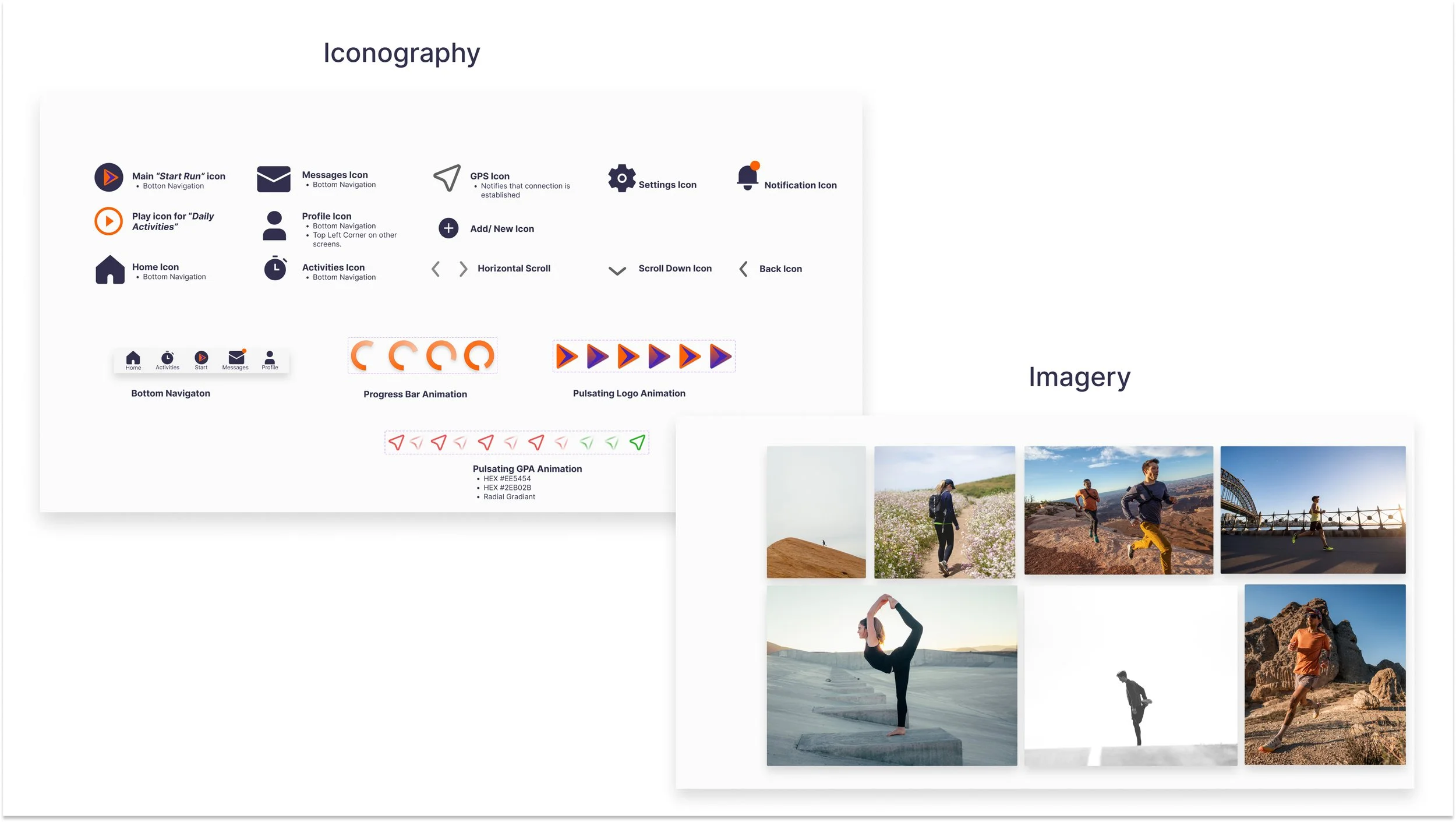
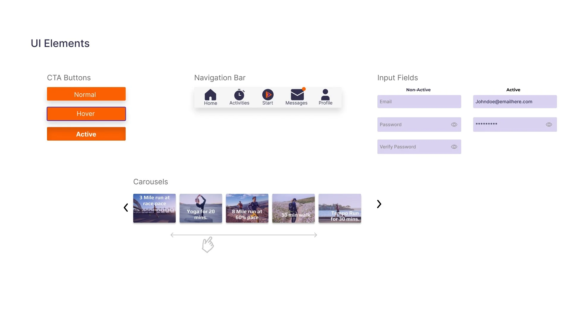
STYLE GUIDE

PROTOTYPE
Armed with paper and pencil, I quickly put together sketches of low-fidelity design. Based on previous experiences with a product similar to this, I already knew what I wanted and what features it should have.
After a few iterations with the designs, this is my Mid-Fidelity. By blocking certain areas for certain features I had a better ideas of what I wanted in my product.

This is the final result of my wireframes. With the user of proper UI etiquette, I was able to produce a consistent design throughout.

MULTIPLE BREAKPOINTS


REFLECTIONWhat I Learned
Keep your design consistent throughout multiple breakpoints
Design starting with the smallest device
Again, things will change. Never try to “perfect” a design
Just because it looks aesthetically pleasing, does it function just as well?
Future Plans
Create a Design System
Organize my files better with a better system
Get rid of my perfectionism because that will hurt you in the end
Never be afraid to ask for help.