
Rethink. Redesign.
Over time I’ve realized that my original work called for a change. I needed to be proud of it again. Deciding to redo and redesign some of the screens for my project was a daunting task, but I needed to enhance user experience and address feedback gathered since its initial release.
Version 1, while functional had certain usability issues and lacked some key features that users were requesting. The re-design aims to create a more seamless and enjoyable user journey, incorporating modern design principles and ensuring the app aligns with the evolving needs and expectations of its user base.
The re-design also taught me about how I grew as a designer. It reflects a commitment to continuous improvement, responsiveness to user input, and to deliver a product that not only meets but exceeds user expectations.
-

Sign Up
The re-design of the Sign Up screen provided a direction to where the rest of the application would take place. The goal is to continue the design language to the rest of the screens. .
-

Dashboard
Continuing the design language to the main Dashboard. The goal is to have an updated minimal design and to not overwhelm the users. Basic data and needs are front and center.
-

User Profile
User Profile has been moved to its own screen, compared to the previous design where it was in the dashboard. Moving to a separate screen allowed the user to have more detailed information available in the palm of their hand.
-

Health History
Important data such as vital signs are more clear and easily digestable. This can act as a miniature version of a hospital’s EMR System. The Health History page was influenced by Apple’s own Health app.
-

QR Code
The QR-Code screen has been updated for a cleaner interface compared to the original design. This is one of the more important features of the app. To be able to integrate with the hospital’s existing EMR System.
-
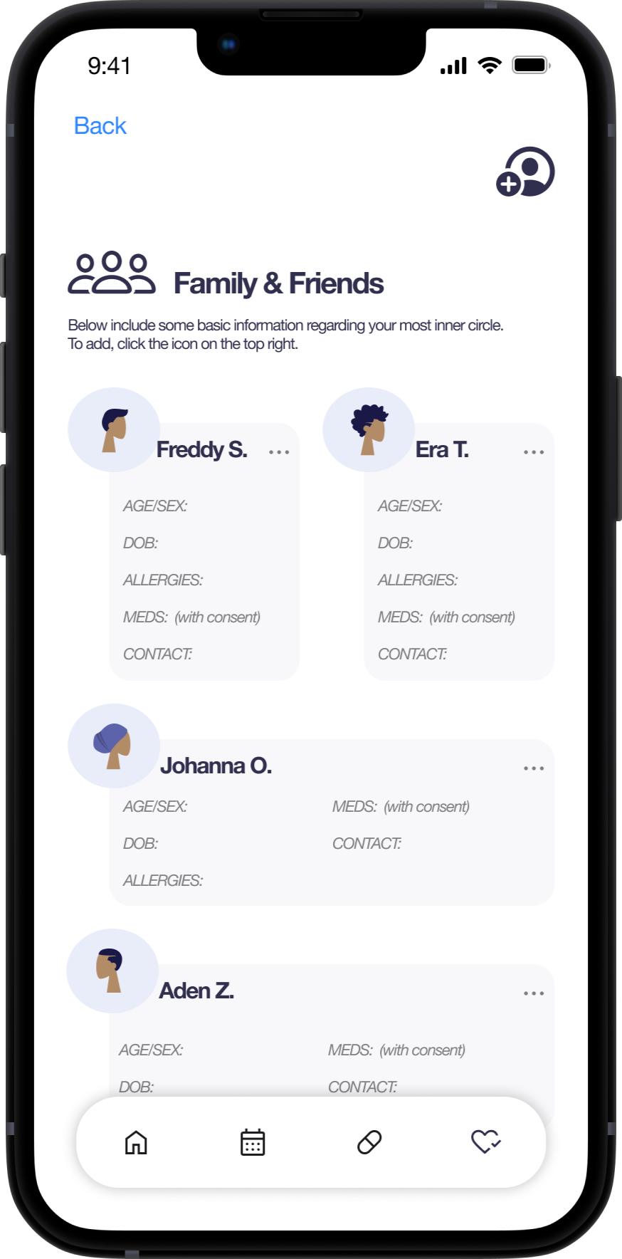
Family & Friends
Family & Friends section has been redesigned to match the interface for the rest of the app. The layout is similar to widgets in an iOS device where the user can dictate the shape of each family/ friend’s card.

Reflection:
Looking back, to move forward. Reflecting on the original design allowed me to provide a clear understanding of what I know now as a designer. The learning process will never stop, but it’s good to ask yourself, what would I change or do differently? Updating the look and feel of the app provided me with as much joy as similar to when I first started this journey of being a UX Designer. Comparing the older design to the new one brought a smile to my face and reassured me to stop thinking negatively about my abilities. This is all part of the process of growth. You have to start somewhere. I hope this brings you joy as much as it did to me. Thank you for your time.