AutonoME
A UX/ UI Case Study
Timeline
Approx. 7-9 Months
Area of Interest
Healthcare
My Role
UX Design Student solo project for CareerFoundry
PROBLEMIn a mobile-centric world where accessibility is available for every asset of your life, why is health information not as accessible?
What if you had access to your health information even before stepping into the hospital?
Users need a way to access their medical data to communicate with their providers when being admitted to a hospital or a clinic. Not providing accurate information could lead to errors when administering care.
Let me ask you this?
If you were to take your loved ones to the hospital, would you be able to produce an accurate medical history for them? Not only for them, but what if you are admitting yourself?
Could you do the same?
SOLUTIONWhat if there’s a product that compiles and organizes health data that a user can confidently keep track of?

Accessibility Is Key
Capitalize on the use of QR-Code for sharing.
Easily transfer data from one institution to another.
Everything Within Reach
Giving you the power to control your own health information.
A one-stop shop for all of your medical data
Available throughout multiple devices

Be An Advocate
Connect to your Family & Friends
Provide an accurate health history when escorting your Grandma to her appointments
Have an overview of everyone’s health status (with consent)

RESEARCH87% of patients say they want to control their health data, based on a survey by Accenture.
User Interviews & Competitive Analysis
To understand the problem of creating an app in this particular space. I interviewed six different people that were divided into 3 patients and 3 clinical staff to gather qualitative data. The goal of these is to collect data on their attitudes, behaviors, and emotions about the product.
“If a patient had access to this type of app. it would benefit me in a way that if they show up at the hospital without any history, I could have a sense of direction on how to provide care.”
“I didn’t remember the last medication they gave my Grandma.”
Based on my market research, there are two well-known companies that are on top. After analyzing the 2 most apps in this space, I was able to see areas where I can flourish in.


PERSONASTo cover different perspectives for this project. I created four personas, two are patients and the other two are clinical staffs. One thing in common for them is keeping track of health information is important.
The Athlete
Grandma’s Favorite
Old School Nurse
Tech-Savvy Doctor

INSIGHTBy creating a medical record app that utilizes customer data platforms where a user can have access to it, I will be able to fill a gap in the healthcare system regarding patient’s data.
Card Sorting & Sitemap
The Hyrbid Method of card sorting was conducted based on the user‘s feedback. It guided the users on basic labels but did not limit them to creating their own.
A total of seven participants joined, with an average time of 3 minutes & 42 seconds for completion to sort 20 cards.

After a few iterations of the Sitemaps and the results from card sorting, I’m can provide a more cohesive experience for the users as they go through the app and limit the occurrence of getting lost.

Before

After
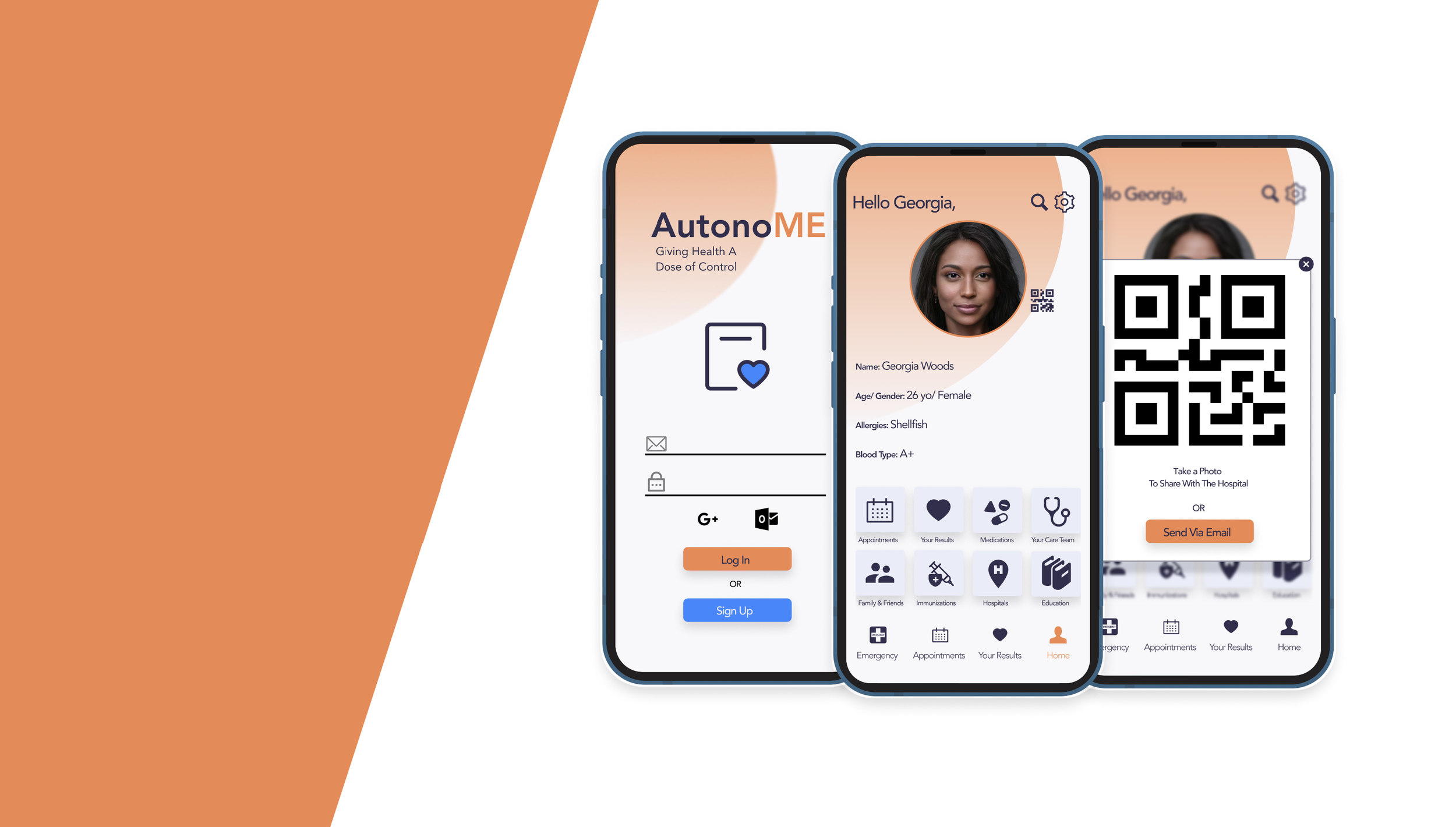
PROTOTYPEWith the outcome of the Sitemap, I had a path to follow when sketching for the Low-Fidelity Designs. The three main features of the app must be easily accessible throughout the application. These include the Home Screen, Family & Friends, and Your Results. With the sketches done, I confidently moved on to Mid-Fidelity Wireframes.
With the use of Mid-Fidelity Wireframes, I conducted usability testing to locate any pain points the user may have which I will share the results at the bottom.


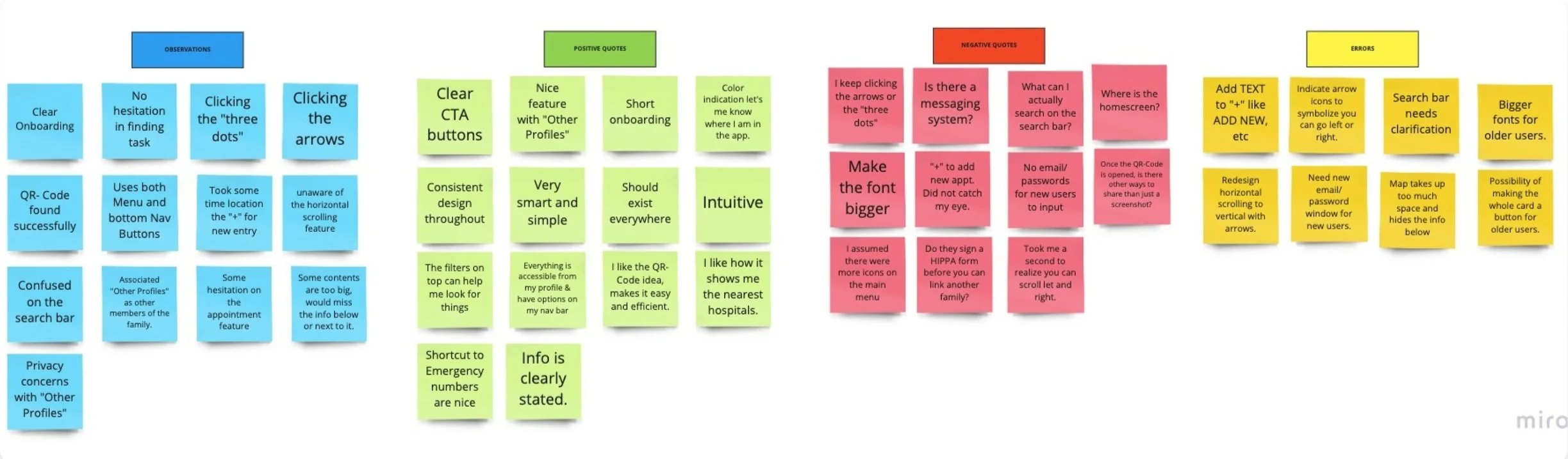
TESTINGUsability Testing and Affinity Maps
Usability Testing was conducted with 5 participants using Moderated In-Person & Moderated Remote Testing
Goals
Learnability of new users interacting with a patient electronic medical record app.
Does the participant know why the app exists and its value?
Complete basic functions, including but not limited to logging in, viewing test results, and accessing other profiles.
Is the app’s overall layout easy for the participants to find what they need?
Test Objectives
Measure the time it takes a user can complete a specific task. For example, checking their most recent test results.
Finding paint points of frustration with the three main features.
Observe where a participant can get stuck in the app.
Usability Test Insights
Users not utilizing the horizontal scroll feature
Clarification on actions like the search bar area needed to be clear. (What can I actually search?)
Confusion on buttons and icons left the users lost
The design is consistent throughout the app
Results
I was able to gather important feedback. Certain design elements that I thought would be useful, turned out to be a hindrance to the users.
Overall, the testing session that provided valuable insights that I could implement with my design and move forward with the product.
A recent study shows that online patient engagement through patient portals can actually improve chronic disease management.
STYLE GUIDE


FINAL PROTOTYPE


“Patient engagement is the act of patients and providers working together toward the end goal of improved patient wellness.”
REFLECTIONWhat I learned
It will always change, the best thing for you to do is to just start.
Patience is key, you won’t learn everything overnight. Take time to understand what you are doing.
Always have a student mentality.
Conducting correct and proper research will set you up to have a more complete product and less wasted time in the end.
Don’t be afraid to ask for help.
Future Plans
Learn the different tools to be a successful User Experience Designer.
Find my proper workflow and improve on organizational skills.